(303) 999-8864
2026-denver-interior-design-trends
Explore 2026-denver-interior-design-trends. DAECO explores the shift to warm, curated spaces using tobacco and olive tones optimized for 5,280 feet of altitude.
INTERIOR DESIGNHOME IMPROVEMENT2026 COLOR TRENDS
DAECO Painting Company | Denver Interior Painting Experts Since 2003
3/8/20265 min read
Home > Denver Interior Painting > Design Guides > 2026 Interior Trends
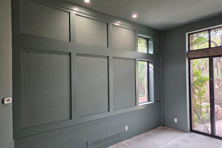
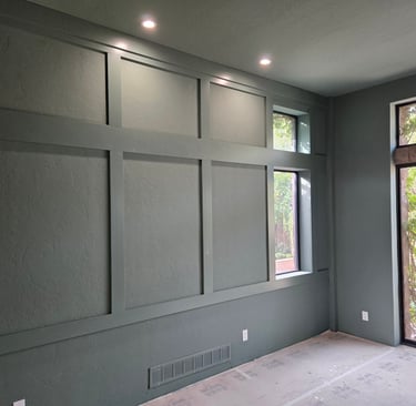
In Congress Park (80206), Washington Park (80209), and Cherry Creek (80206), homeowners finishing Benjamin Moore and Sherwin-Williams interior painting projects are asking different questions than they did two years ago. "What's the perfect greige?" is being replaced by "How do we create warmth?" The shift is deliberate, measurable, and architectural. DAECO Painting Company, serving Denver since 2003, has observed the transition firsthand: sterile minimalism is ending. Warm, curated, purposeful interiors are beginning.
At 5,280 feet, where Colorado's intense natural light exposes every design decision with unforgiving clarity, this trend shift matters technically. The browns, cognacs, olives, and tobacco tones defining 2026 perform differently under Denver's high-altitude UV than they would at sea level. Investment materials—unlacquered brass, real stone, hand-planed walnut—require surface preparation protocols that acknowledge climate behavior, not just aesthetic preference.
This is not decoration. This is calibrated spatial design for how Denver homeowners actually live in 2026.
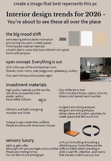
The Big Mood Shift: What's Ending, What's Beginning
Leaving Behind (2015-2024):
All-white everything (builder white, stark contrast, cold Scandinavian minimalism)
Open-concept everything (visual noise, acoustic chaos, no spatial intimacy)
Uniform showroom aesthetics (Instagram-copied, lacks personality)
Gray-dominated palettes (Agreeable Gray, Repose Gray, Mindful Gray)
Moving Toward (2026):
Layered warm neutrals (browns, cognacs, warm taupes, tobacco, olive, ink)
Architectural rooms with purpose (libraries, music rooms, sculleries, speakeasies)
Mixed materials creating lived-in feel (antiques + artisan pieces + custom upholstery)
Sensory luxury (soft lighting, rich fabrics, controlled acoustics)
The Neurological Basis for the Warm Material Shift
Environmental psychology research demonstrates that warm colors (reds, browns, ochres) create perceived coziness and intimacy, while cool colors (blues, grays, whites) create perceived spaciousness and detachment. In Denver's bright, blue-spectrum light at 5,280 feet, cool colors intensify—whites appear stark, grays read cold, rooms feel impersonal.
Warm neutrals counterbalance Denver's naturally cool light temperature. Benjamin Moore's Shenandoah Taupe (HC-97), Sherwin-Williams' Renwick Beige (SW 2805), and cognac-toned leathers absorb blue wavelengths rather than reflecting them, creating psychological warmth that white walls cannot provide.
2020 Cause → Effect Performance in Denver's 2026 Interiors
The Problem Sterile Minimalism Created: Sterile minimalism succeeded in Denver's real estate market because high-altitude light made white walls appear bright and spacious. However, homeowners living in those spaces long-term reported feeling cold, impersonal, and acoustically uncomfortable in open-concept layouts with hard surfaces echoing sound.
The Effect of 2026's Material and Color Shift:
Walnut millwork absorbs sound, reducing echo.
Cognac leather softens visual glare from Denver's intense western sun.
Defined library spaces create intimacy that open-concept great rooms cannot.
Tobacco and olive paint tones ground spaces psychologically, preventing the "cold gallery" feel.
The Death of Open Concept: Architectural Rooms Return
Why This Matters in Historic Homes: Bungalows in Washington Park built in the 1920s originally featured defined rooms. Open-concept renovations (2005-2020) removed walls to create "flow." Now, homeowners are reinstalling architectural separation—not full walls, but pocket doors, arched openings, and half-walls with built-in shelving.
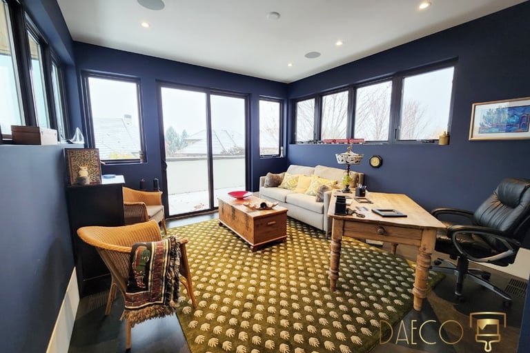
Technical Application: When we paint a newly defined library in a 1928 bungalow, the strategy changes. The library gets Benjamin Moore's Brown Horse (2108-30)—or Farrow & Ball’s Tanner’s Brown (255) —a deep, enveloping warmth. The adjacent living room gets a transitional neutral like Shenandoah Taupe (HC-97). The shift between spaces signals a change in purpose.
IInvestment Materials: High-Quality Becomes the New Flex
The Material Shift:
2015-2024 "Luxury": Quartz countertops, engineered hardwood, chrome fixtures, painted cabinetry
2026 Luxury: Real stone (marble, limestone, soapstone), solid hardwood (walnut, white oak), unlacquered brass, hand-planed millwork
Why This Matters for Paint Application: Real materials require different paint adjacency than engineered materials. Unlacquered brass develops warm patina—pair it with warm paint tones (cognac, tobacco, olive), not cool grays. Hand-planed walnut has visible texture—pair it with matte or eggshell sheens that don't create glare competition.
When DAECO Painting Company works on Cherry Creek renovations featuring investment materials, we adjust:
Sheen selection: Matte finishes on walls let natural stone be the reflective element
Undertone matching: Warm brass requires warm paint undertones (red-biased, not blue-biased)
Surface prep: Real plaster walls (common in Congress Park historic homes) get different prep than drywall
Your White Era Is Over: 2026's Brown, Cognac, Olive, and Tobacco Palette
The Color Reality in Denver Homes: Browns, cognacs, olives, and tobacco tones perform differently at 5,280 feet than at sea level. Colorado's low humidity (25-30% average) means pigments cure harder and faster, creating more saturated color depth. High-altitude UV can shift undertones—browns can read redder, olives can appear more golden.
Strategic Color Application for Congress Park, Wash Park, and Cherry Creek:
Kitchens Going Moody:
Benjamin Moore's Mopboard Black (1000) on lower cabinets
Unlacquered brass hardware & real marble countertops
Bathrooms Getting Richer:
Benjamin Moore's Shenandoah Taupe (HC-97) creating spa-like warmth
Cognac leather vanity stools & unlacquered brass fixtures
Living Spaces Embracing Tobacco and Olive:
Farrow & Ball's Mouse's Back (40) for sophisticated neutrality
Benjamin Moore's Weimaraner (AF-155) for warm gray-brown
Layered with walnut millwork and cognac leather furniture
Unique Over Uniform: Mixing Antiques and Artisan Pieces
The Design Philosophy Shift: 2026 is "collected, not copied." Grandmother's credenza + custom velvet sofa + artisan pottery + vintage rug.
Why This Requires Better Paint: When you're mixing eras and styles, paint becomes the unifying element. It must be intentional color that relates to the collected pieces. DAECO might specify:
Walls: Benjamin Moore's Alexandria Beige (HC-77)—warm enough to honor vintage wood.
Trim: Benjamin Moore's White Dove (OC-17)—softer than stark white.
Ceiling: Same as walls (2026 trend: stop painting ceilings stark white).
Sensory Luxury: Lighting, Fabrics, Acoustics
The Paint Connection: Matte and eggshell paint finishes absorb sound better than semi-gloss or high-gloss. In Cherry Creek homes where acoustic comfort matters, we specify:
Walls: Matte or eggshell (Benjamin Moore Regal Select Matte, Aura Matte)
Ceilings: Matte always (prevents overhead light reflection and echo)
Trim: Satin maximum
Common Misconception in Denver Interior Design
The Assumption: "Dark colors make small rooms feel smaller." The Reality: Dark, warm colors create perceived intimacy and coziness that expands emotional comfort. In Denver's intense light, dark colors ground spaces and prevent visual glare.
Field Evidence from DAECO Projects: We've painted identical-sized bedrooms (12x14) in Cherry Creek Country Club :
Ceiling and Base: Benjamin Moore Chantilly Lace (white)—felt bright but cold, acoustically harsh.
Office walls: Deep Royal 2061-10 by Benjamin Moore: Benjamin Moore's Shenandoah Taupe (warm brown)—felt intimate, restful, acoustically soft.
Climate-Specific Reasoning: Why 2026 Trends Work Differently in Denver
Altitude Impact on Performance (At 5,280 feet):
UV exposure 25% higher—accelerates fading.
Low humidity (25-30%)—pigments cure harder, colors appear more saturated.
Blue-spectrum light—intensifies cool tones.
DAECO's Climate-Controlled Protocol:
Substrate moisture evaluation (<15% for proper cure).
Climate-controlled application (40-50% RH maintained during cure).
UV-stabilized pigment selection (Color Lock formulations).
Three-coat minimum for color saturation and durability.
FAQ
Q: What are the biggest interior design trends for Denver homes in 2026? The shift is from sterile minimalism to warm, curated spaces. Key trends include: layered warm neutrals (browns, cognacs, olives, tobacco), architectural rooms with defined purpose (libraries, sculleries), investment materials (real stone, solid walnut), and sensory luxury.
Q: How does Denver's altitude affect 2026's warm color trends? At 5,280 feet, UV exposure is 25% higher and light is blue-spectrum dominant. Warm colors counterbalance this naturally cool light, creating psychological warmth that white walls cannot provide.
The DAECO Difference: Since 2003, DAECO Painting Company has translated design trends into climate-appropriate technical application for Denver homeowners. This isn't decoration. This is spatial engineering for how you actually live at 5,280 feet.
Ready for Your Custom Quote?
As we hope you've learned, we take every aspect of your house into account when determining the cost of painting your home. Get in touch with us so we can provide you a detailed cost for painting your home.
303-999-8864
DAECO PAINTING COMPANY© 2026. All rights reserved.
Service Solutions
Paint Options
Local Service Locations
DAECO Painting, established in 2003, is a trusted and recognized high-end paint and decorating contractor. We specialize in custom luxury residential painting projects, including repaints, historical restorations, and new construction homes and lofts. Our expertise lies in delivering flawless Level 5 finish results, with a primary focus on high-end fine finish repaints and new custom home builds and remodels. We cater to all residential clients, from the average consumer to the elite, and our commitment to quality and service remains consistent across every project.
Vail, CO
Aspen, CO
Winter Park, CO
Breckenridge, CO