(303) 999-8864
2026 Interior Paint Trends: Replacing Gray with Warm Neutrals
2026 interior paint trends reveal gray is fading. Discover warm neutrals, moody tones, and expert strategies for luxury home interiors. Contact DAECO today.
INTERIORSINTERIOR DESIGNLOCAL SERVICES
DAECO PAINTING
1/7/20263 min read
A Luxury Painting Perspective on the End of Cool Gray
For nearly a decade, cool gray dominated interiors. It photographed well, felt modern, and was easy to specify across large homes. In 2026, that era is decisively ending—particularly in high-end residential interiors.
From a luxury painting and restoration standpoint, gray hasn’t fallen out of favor because it is neutral. It has lost relevance because it no longer performs well under modern conditions: contemporary lighting, natural materials, and elevated design expectations. Designers and discerning homeowners are no longer asking “What’s safe?” They’re asking “What will age beautifully?”
Why Cool Gray Is Declining (Design + Performance Factors)
The decline of gray is rooted in performance, not opinion. One of the most overlooked factors is metamerism—the scientific phenomenon where a color’s appearance shifts depending on the light source.
The LED Conflict: As residential lighting has moved toward LED temperatures in the 3000K–4000K range, the blue-violet spikes in the LED spectrum "activate" the hidden undertones in gray paint. This causes many grays to read as sterile purple, blue-white, or flat under real conditions.
Pigment Stability: By contrast, the warm neutrals replacing gray are formulated with iron oxide, umber, and earth-based pigments that remain visually stable under these wavelengths.
Material Compatibility: Gray often conflicts with the natural woods, stone, and European finishes (like limewash) currently leading luxury real estate.
In luxury homes, gray increasingly reads as transitional at best, dated at worst—especially when paired with high-end millwork and custom finishes.
The New Neutral Class (True High-Growth Replacements)
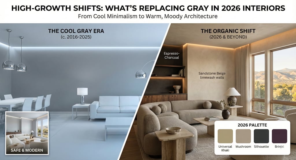
Visual Quick-Reference: The 2026 Shift
Warm Neutrals: The Structural Successors
Warm neutrals are the new foundation layer for 2026 interiors, supporting natural materials and layered design.
Universal Khaki (SW 6150): Anchoring 2026 palettes with organic, "essentialist" warmth.
Sandstone Beige: Emerging as the dominant whole-home neutral.
Pashmina (AF-100): A strategic bridge for homeowners transitioning away from gray.
Rising Moody Tones (Where Depth Replaces Coolness)
Where gray once provided contrast, designers are now choosing earth-infused depth. These colors add architecture, not decoration.
Fast-Growth Categories:
Espresso-Charcoal Blends: Rich, warm tones that avoid blue undertones.
The "New Browns": Mahoganies and chocolate tones are surging as homeowners seek comfort and "Quiet Luxury."
Designer-Specified Leaders: Silhouette (AF-655) — Benjamin Moore’s 2026 Color of the Year — a fashion-driven espresso-charcoal adaptable to walls and millwork.
Note: These deep palettes require precise surface prep and uniform substrates; errors in the wall's foundation are amplified, not hidden, by darker pigments.
The Denver Advantage: Local Light Considerations
In Denver, altitude-driven light clarity significantly impacts color perception. At elevations above 5,280 feet, UV intensity is higher and the atmosphere is thinner. This increased clarity "washes out" cool colors, often pushing grays toward an icy blue-white during peak daylight hours.
The 2026 warm palette—particularly sandstone and mushroom foundations—provides the visual weight necessary to ground interiors under Colorado’s brightest conditions, maintaining balance from morning sun to late afternoon glare.
From Consulting to Execution: How Luxury Interiors Succeed
As palettes warm and deepen, the margin for error narrows. Successful outcomes require a three-phase approach:
1. Strategic Consulting
Color Architecture: Whole-home strategy, not isolated rooms.
Undertone Analysis: Accounting for 4000K LED spikes and altitude-driven light.
Material Coordination: Syncing paint with wood species (Walnut/Oak) and stone.
2. Foundation Phase (Preparation)
Substrate Refinement: Skim coating and wall correction to ensure deep tones lay flat.
Millwork Prep: Proper bonding for high-performance cabinetry finishes
3. Delivery Phase (Precision)
Architectural Transitions: Sharp, clean detailing where deep tones meet light neutrals.
Specialty Finishes: Applying limewash or Venetian plaster to add the "Authority Layer" of texture.
The 2026 Investment Outlook
Transitioning away from a gray-based home requires more than a new bucket of paint—it requires a recalibration of light, texture, and substrate. Warm neutrals and earth-based moody tones ensure relevance for the next five to ten years.
Ready to Transition?
The process should begin with a Color & Finish Architecture audit—ensuring every decision supports longevity, material harmony, and flawless execution. Contact us today
303-999-8864
DAECO PAINTING COMPANY© 2026. All rights reserved.
Service Solutions
Paint Options
Local Service Locations
DAECO Painting, established in 2003, is a trusted and recognized high-end paint and decorating contractor. We specialize in custom luxury residential painting projects, including repaints, historical restorations, and new construction homes and lofts. Our expertise lies in delivering flawless Level 5 finish results, with a primary focus on high-end fine finish repaints and new custom home builds and remodels. We cater to all residential clients, from the average consumer to the elite, and our commitment to quality and service remains consistent across every project.
Vail, CO
Aspen, CO
Winter Park, CO
Breckenridge, CO