(303) 999-8864
Benjamin Moore’s 2026 Color of the Year: Silhouette AF‑655 — Defining Denver’s New Era of Sophisticated Design
Discover how Benjamin Moore’s 2026 Color of the Year, Silhouette AF-655, is defining Denver's newest design trends. Find expert tips on pairing this refined neutral for your home.
INTERIOR DESIGNPRODUCT REVIEWBENJAMINE MOORE PAINTS
DAECO PAINTING
10/17/20254 min read
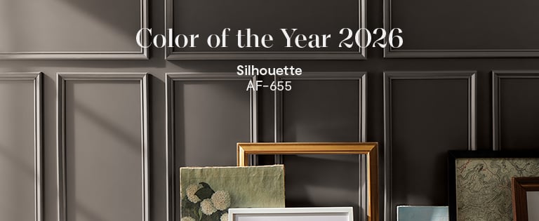
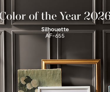
As Denver homeowners shift toward warmer, grounded interiors, Benjamin Moore’s 2026 Color of the Year — Silhouette AF‑655— captures that evolution beautifully. A refined espresso brown interlaced with soft charcoal undertones, Silhouette establishes itself as a luxury neutral with soul.
In Denver’s natural sunlight, this hue transforms throughout the day: morning light highlights subtle violet undertones, while evening glow brings out its rich brown warmth. It’s the ideal centerpiece for a color story inspired by craftsmanship, balance, and timeless style—key themes shaping Denver interior design trends heading into 2026.
The Inspiration: Craftsmanship Meets Calm
According to Andrea Magno, Benjamin Moore’s Director of Color Marketing, Silhouette “embodies the luxurious blend of burnt umber and delicate charcoal undertones,” echoing the tailored textures of bespoke fashion.
Like a perfectly fitted blazer, Silhouette defines structure without rigidity. It complements the modern mountain aesthetic seen across Cherry Creek, Evergreen, and Castle Pines homes—where moody neutrals pair with organic finishes and artisan details.
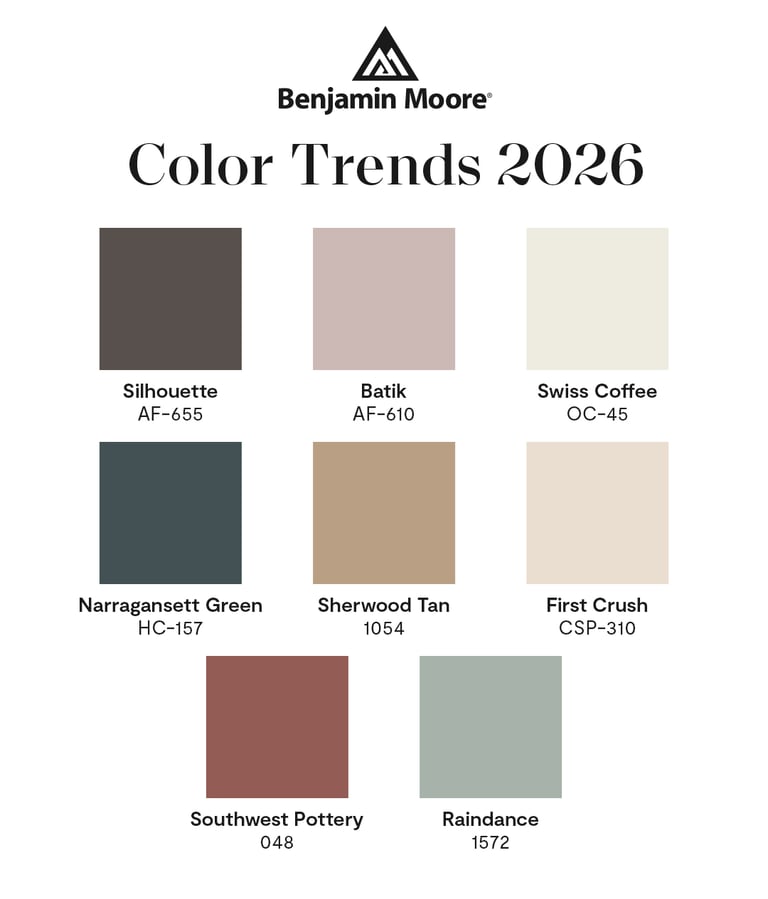
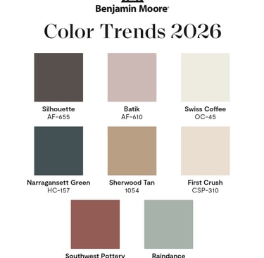
The 2026 Benjamin Moore Color Palette: Harmony and Contrast
Benjamin Moore’s 2026 Color Trends Palette features eight carefully curated hues that layer effortlessly to complement the sophisticated espresso brown of Silhouette AF‑655. This color of the year, characterized by its soft charcoal-violet undertones, serves as a rich, grounding centerpiece perfect for modern Denver interiors.
The palette includes four Enchanting Pales that provide balance and lightness. Raindance 1572 offers a calming steely green-gray that evokes tranquility, while Swiss Coffee OC‑45 brightens spaces with a warm off-white infused with subtle almond undertones. First Crush CSP‑310 introduces a delicate blush-neutral, ideal for soft contrasts against deeper tones, and Batik AF‑610 adds vintage charm with its dusty mauve tint.
Complementing these are four Handsome Midtones that deepen the palette's warmth and texture. Narragansett Green HC‑157 is a deep blackened teal rich with historic character, blending well in layered, earthy interiors. Southwest Pottery 048 lends an authentic clay-inspired terracotta tone, bringing the warmth and raw beauty of Colorado’s natural landscapes indoors. Lastly, Sherwood Tan 1054 acts as a golden tan neutral that grounds and warms any room with subtle elegance.
Together, these harmonious hues offer versatility and depth, perfectly aligning with evolving Denver interior design trends and creating interiors that feel both timeless and inviting.
How Complementary Colors Transform Silhouette
Raindance 1572: This muted green with gentle gray undertones adds freshness to Silhouette’s espresso base. When used for cabinetry or accent chairs, it softens dark walls and channels Denver’s serene outdoors—a nod to the city’s love of natural balance and biophilic design.
Southwest Pottery 048: The warmth of this clay‑inspired terracotta brings organic contrast to Silhouette. Used for textiles, statement doors, or dining alcoves, it evokes the earthy tones of Colorado’s red rock landscapes.
Swiss Coffee OC‑45: A timeless favorite among Denver designers, this creamy neutral keeps Silhouette interiors from feeling heavy while maintaining elegance.
Batik AF‑610 and First Crush CSP‑310: Perfect for layered accent palettes, these dusky mauves and warm blushes enrich Silhouette’s moody appeal without overwhelming the senses.
Together, these shades create an elevated Benjamin Moore color palette that feels curated, timeless, and distinctly suited to Denver’s architectural diversity.
Best Uses of Silhouette in Denver Homes
Living Rooms: Frame Silhouette on walls with Swiss Coffee or Sherwood Tan trim. Add Raindance textiles for a natural accent.
Dining Rooms & Theaters: Immerse the space in Silhouette to create classic, enveloping warmth—use Southwest Pottery for statement pieces or feature walls.
Bedrooms: Mix First Crush on accent linens with Silhouette for luxurious serenity.
Front Doors & Entryways: Elevate first impressions with a Silhouette‑painted door, complemented by brushed brass fixtures—a look increasingly popular in Capitol Hill and Greenwood Village remodels.
Expert painters at DAECO Painting ensure every variation of light and texture enhances the richness of Silhouette while keeping edges flawless for that “tailored” effect.
FAQ — What Homeowners Want to Know
Q: How does Silhouette AF‑655 fit Denver’s 2026 interior design trends?
It’s part of the broader move toward warm neutrals, organic materials, and fashion‑inspired detailing that echo both urban refinement and mountain serenity.
Q: What are the best complementary colors for Silhouette?
Raindance, Swiss Coffee, and Southwest Pottery form the strongest triadic palette—combining cool balance, clean brightness, and earthy depth.
Q: Should Silhouette be used in small or large rooms?
Both. In smaller spaces, contrast it with Swiss Coffee to maintain openness; in larger rooms, it anchors expansive layouts, adding intimacy and drama.
Q: Is professional painting worth it for dark, rich tones like Silhouette?
Yes. Premium application ensures even coverage, durability, and maximum color fidelity—especially critical in Denver’s variable mountain light.
Why DAECO Painting Leads in Denver’s Color Expertise
DAECO Painting sets the standard for expert color consultation and detailed residential painting across the Denver metro area. With firsthand experience in application precision, lighting calibration, and product performance, our team understands that color is both science and art.
We help homeowners choose hues that enhance every architectural element—from LoHi lofts to Cherry Hills estates—bringing Benjamin Moore’s color palette to life with unmatched craftsmanship.
303-999-8864
DAECO PAINTING COMPANY© 2026. All rights reserved.
Service Solutions
Paint Options
Local Service Locations
DAECO Painting, established in 2003, is a trusted and recognized high-end paint and decorating contractor. We specialize in custom luxury residential painting projects, including repaints, historical restorations, and new construction homes and lofts. Our expertise lies in delivering flawless Level 5 finish results, with a primary focus on high-end fine finish repaints and new custom home builds and remodels. We cater to all residential clients, from the average consumer to the elite, and our commitment to quality and service remains consistent across every project.
Vail, CO
Aspen, CO
Winter Park, CO
Breckenridge, CO