(303) 999-8864
Best place in a home for dark, moody colors?
Discover the best place in a home for dark, moody colors? Like navy and forest green in Denver luxury homes. DAECO Painting shares expert tips for 2026 interiors.
INTERIORSINTERIOR DESIGNLOCAL SERVICES
DAECO PAINTING
12/9/20252 min read
Home > Blog > Interior Painting Trends > Best Place for Dark Moody Colors
Where to use dark, moody colors?
Home > Blog > Interior Painting Trends > Best Place for Dark Moody Colors
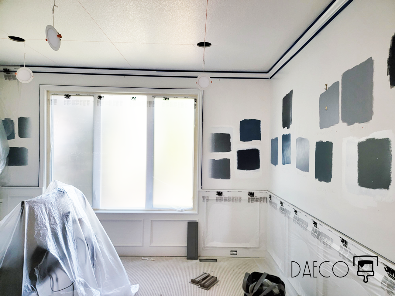
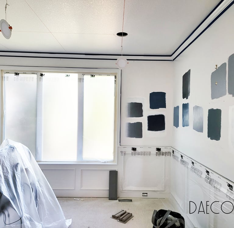
Dark, moody colors thrive in specific home areas where they create intimacy without overwhelming brightness, especially in sun-drenched Denver residences. Low-natural-light zones like dens, dining rooms, powder baths, and basements maximize their cozy, luxurious drama. These spaces benefit from color-drenching techniques that transform them into gallery-like retreats, countering the city's high-altitude glare.
Why Room Choice Matters for Moody Palettes
Moody hues—deep navy, charcoal gray, forest green, plum-brown—absorb light beautifully but can feel heavy in overly bright areas. In Denver's Cherry Creek or Wash Park homes, south-facing rooms amplify sunlight, so reserve full saturation for enclosed spaces. Designers emphasize pairing with warm LEDs, brass fixtures, and textures like velvet to prevent dreariness while enhancing sophistication.
Top Rooms for Moody Color Transformations
Experts, Reddit threads, and local Denver designers agree these low-light areas deliver maximum impact:
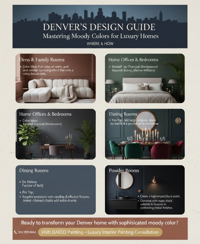
Dens and Family Rooms: Perfect for cocooning. Drench walls, trim, and ceilings in Benjamin Moore’s Cinnamon Slate or Sherwin-Williams Roycroft Bronze Green—users rave they’re “cozier than ever” for TV nooks.
Dining Rooms: Deep blues like Farrow & Ball De Nimes or burgundies amplify candlelit ambiance. Jewel-toned chairs add drama without commitment.
Powder Rooms and Basements: Bold plums or inky blacks on cabinets and walls create “wow” moments. Ideal for experimentation in compact spaces.
Home Offices and Bedrooms: Hunter greens or taupe-grays promote focus and rest, excelling under high ceilings or north-facing windows.
Avoid: Sunny kitchens or great rooms unless north-facing—opt for accents like islands or backsplashes instead.
Denver Designer Insights on Placement
Nadia Watts favors navy-to-purple schemes in dens for womb-like intimacy. Karyn Wingard layers moody tones in basements and dining areas for lived-in elegance. Studio Rhodes pushes muddy plums in powder rooms with walnut accents, aligning with 2025 trends from Colorado Homes Mag.
Paint Picks and Pro Tips by Room
Test samples in morning light; balance with unlacquered brass and dark woods.
DAECO: Precision Moody Painting in Denver
DAECO Painting perfects moody applications for Denver’s luxury homes, from LoHi lofts to Hilltop estates. Schedule a consult to match shades to your architecture and light. Luxury Interior Painting | Consultations.

303-999-8864
DAECO PAINTING COMPANY© 2026. All rights reserved.
Service Solutions
Paint Options
Local Service Locations
DAECO Painting, established in 2003, is a trusted and recognized high-end paint and decorating contractor. We specialize in custom luxury residential painting projects, including repaints, historical restorations, and new construction homes and lofts. Our expertise lies in delivering flawless Level 5 finish results, with a primary focus on high-end fine finish repaints and new custom home builds and remodels. We cater to all residential clients, from the average consumer to the elite, and our commitment to quality and service remains consistent across every project.
Vail, CO
Aspen, CO
Winter Park, CO
Breckenridge, CO